Brand Identity Guidelines
The Importance of the Brand
Founded in 1971, Special-Lite® is the most recognizable brand and highest volume producer of commercial FRP doors in the United States. Nearly 50 years after its inception, Special-Lite has experienced growth, acquisition, and greatly expanded its product portfolio. However, the Special-Lite brand remains true to its roots: High-performance, durable products and a focus on people from customers and employees to those in the community.
These guidelines have been created to help you emphasize the brand’s strengths, and protect it from being misused. A strong brand is an asset, and brand recognition and consistent presentation are critical for the company’s continued growth and success. These guidelines explain the brand voice or style in which Special-Lite communications should address the world. They also establish the brand identity system, its colors, and corporate typefaces.
Special-Lite’s brand guidelines have been created for all who have an interest in the success of the Special-Lite brand, these guidelines apply to the creation of items such as ads, websites, posters, labels, signage, business cards, stationery, and other materials both internal and external.
Download Our Brand Assets
Logo
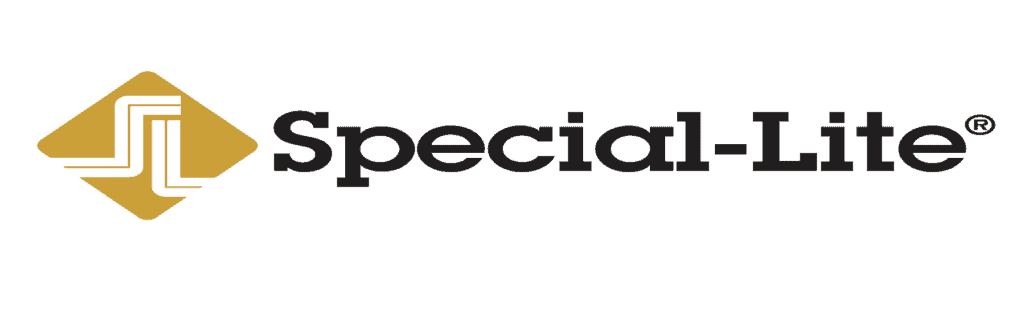
The logotype (the visual representation of the words “Special-Lite”) is not a trademarked element, but should always appear in the form shown here. The logotype should never be used without the mark. A registration symbol (®) should be located on the logotype as shown to indicate that “Special-Lite” is a registered trademark. The registration symbol should always be sized to the minimum size necessary to be legible on the final logo-marked materials.
Two-color positive reproduction of the Special-Lite logo provides the greatest visual impact and should be used everywhere possible. The approved two-color version incorporates the corporate “gold” color with black for the logotype. No color substitution for the corporate color is allowed in two-color usage of the logo.
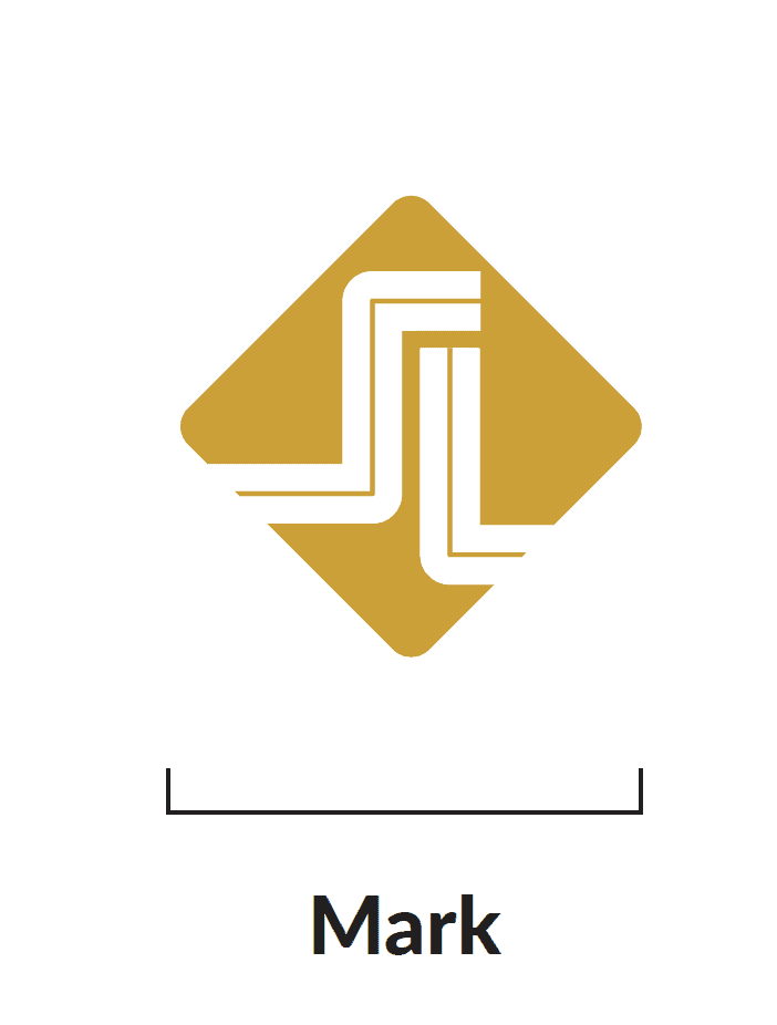
The mark is the visual symbol of Special-Lite. The use of the diamond mark should not be without Special-Lite being identified somewhere on the item. Thus, use of the mark is appropriate in situations where it is used primarily for visual impact or as a secondary identifier on actual products or packaging, and not as the primary identification of the source of goods. This design is not a registered trademark, and if the mark is used alone it must not be shown with the registration symbol (®). The mark should appear in Special-Lite’s corporate color only, except in cases where a single-color or negative (reversed) version of the logo is required.
Logo Color Variations


Logo Clear Space
To ensure an appropriate degree of visual impact, the Special-Lite logo must always be given adequate free space on all sides to avoid visual interference. The preferred clear space around the company logo is white space, without the addition of a color or gradient of any kind. The unit of clear space measurement is identified as “x”. At a minimum, this distance must remain clear of other elements on all four sides.
Incorrect Usage
The logo was re-sized disproportionately and now appears squished.
The background is too busy. The logo should be surrounded by appropriate clear space.
Drop shadow and other effects should not be applied to the Special-Lite logo.
A logo with more contrast should be used for the dark background.
The text is too close to the logo. It should be surrounded by appropriate clear space.
The logo is pixelated. It needs to be a higher resolution.
Brand Color Palette
CMYK 2 31 98 16
RGB 198 146 20
Hex C69214
CMYK 35 48 100 13
RGB 158 120 10
Hex 9E780A
CMYK 60 40 40 100
RGB 26 26 26
Hex 1A1A1A
CMYK 63 60 64 65
RGB 51 51 51
Hex 333333
CMYK 7 5 5 0
RGB 235 235 235
Hex EBEBEB
CMYK 78 65 52 44
RGB 51 62 71
Hex 333E47
CMYK 6753 32 7
RGB 97 112 136
Hex 617088
CMYK 16 12 9 0
RGB 211 212 218
Hex D3D4DA
CMYK 65 55 66 41
RGB 74 77 67
Hex 4A4D43
CMYK 53 41 55 11
RGB 124 127 113
Hex 7C7F71
CMYK 23 18 25 0
RGB 197 196 186
Hex C5C4BA
CMYK 44 87 78 69
RGB 68 19 18
Hex 441312
CMYK 35 96 91 55
RGB 96 18 17
Hex 601211
CMYK 13 18 14 0
RGB 219 204 205
Hex DBCCCD
CMYK 16 80 78 5
RGB 199 84 67
Hex C75443
CMYK 2 79 85 0
RGB 237 92 56
Hex ED5C38
Our brand colors identify us visually across a variety of platforms. Gold and Black are the Special-Lite brand’s core colors. The colors in the palette were carefully selected both for their ability to complement the core brand color as well as for their representation of Special-Lite.
This palette draws inspiration from Special-Lite’s origin decade, the 1970’s, as well as modern design trends in the commercial construction and commercial interior industries. The palette intends to represent the Special-Lite brand as timeless and dependable with a nod to industry trends and fun personality.
These color options provide the flexibility needed for elements such as type, backgrounds, and graphics. Using these colors ensures consistency and will establish a distinct and recognizable look for Special-Lite.
Mission and Values
Our Mission
Driven to grow through relationships as strong and dependable as our products.
Our Values

PEOPLE
We are a family committed to the success of each other, the satisfaction of our customers, and the support of our communities.

PASSION
We stand behind our products with pride and confidence, supporting our customers with excellent service and innovation.

PERFORMANCE
We strive relentlessly to deliver quality and high performance products to our customers.